Introduction
This is a fourth project done as part of Ironhack Bootcamp. In this project, we were tasked to design a wellness app.
Nikeetaa Sharma. Shubhangi Verma, Daniel Gonçalves
Timeline:
5 Weeks
Team:
Client:
National Heath Institute
My Role:
UX/UI Designer
Tools:
Figma
The Challenge
Our client, The National Health Institute wants us to rethink and design an app (Native IOS or Android) that could promote personal wellness by helping people adopt and maintain a healthy lifestyle. The app can be focused on any category related to personal wellness such as (but not limited to): exercise and fitness, food/diet, meditation, time management, etc.
The scope of the project included:
Design an MVP that focuses on one aspect of wellness and should not attempt to solve every wellness issue that people might be facing.
The app prototype should be focused on the main user flow.
The app should allow users to set up their profiles, set goals, and keep track of their progress.
Users should be informed about the usage of their personal data and allow them to have full control over how to manage their data which includes allowing them to edit, share, or delete their data.
Different screen states, give the users feedback from the system.
The following Functionalities are out of scope for this project:
Login or Sign-up page
Registration consent and cookies
For this project, we chose to design a wellness app that focuses on social media addiction.
Why Social media addiction?
In today’s digital world with easy access to internet, everything is available just a few clicks away like following the latest news and trends around the world, networking, connecting with friends and family, employment opportunities, sharing ideas and opinions, etc. The list can be never-ending and social media plays a very vital role in catering to these needs. While the use of social media helps to keep you updated and staying connected, using it for long hours can have adverse side effects.

In statistics report by addictionhelp.com shown that teens has an average of 7 hours and 22 minutes of screen time per day, and kids 8–12 years old has an average of 4 hours and 44 minutes of screen time per day. Experts agree that over three hours a day is considered “heavy use” and can indicate someone is addicted to social media.

This article by The Guardian says that spending a long time a day on social media platforms, turning to social media when feeling lonely, waking up to social media in the morning, and scrolling through social media as a leisure activity were not considered normal few decades back can have detrimental effects on people’s mental health and well-being. The symptoms can include anxiety, depression, irritability, isolation, distancing oneself from the real world and from family relationships, loss of control, etc. Another study by the National Library of Medicine has also shown social media addiction is classified as behavioral addiction and it is quite similar to any substance abuse disorder with withdrawal symptoms, depression, etc. Studies from The addiction center, have shown that an estimated 27% of children who spend 3 or more hours a day on social media exhibit symptoms of poor mental health, and an estimated 210 million people worldwide suffer from addiction to social media and the internet.
User Research
User Surveys:
After doing some desk research on social media addiction we wanted to know what our users have to say about it, what they want to achieve, how it is affecting them and what are their behaviours towards it. Since user surveys are very effective in gathering feedback from a large number of people in a faster way, we conducted an anonymous survey and formulated a list of questions to know more about our users. The questions we included are on a broad level and aimed at getting insights which are:
We got more than a hundred responses within two days where:
· 97% said they use social media platforms
· 75% of people feel that they need to regulate their time spent on social media.
· 57% use the Android system to use social media.
· 86% feel that their productivity has been reduced due to social media usage.
The important insights from the survey that users experience about the usage of social media platforms are:
“I have the feeling all the time that I need to reduce my time spent on social media, but I just cannot, it’s something addictive that makes me feel guilty”
“I’m losing my time, I don’t have the time to waste it on TikTok videos, but it’s hard to stop, it’s like an escape from my busy life.”
User Interviews:
After analyzing the survey, next we wanted to dig deeper into users’ behaviors and pain points. We conducted four user interviews with people who use social media platforms and want to regulate the time spent on social media. Our interviewees were between the ages of 25 to 54 years old and were from different parts of the world such as Brazil, India, the Netherlands, etc.
Some of the quotes from the interviews are as follows:
“Do some productive activities (if they get the time they spend on social media)” — Aradhana S.
“I want to reduce my time gradually and just use it in the right way and not stop it altogether” — Ramanuj K.
“I keep scrolling on social media for 1 hour at a stretch. I once started doing that then I can’t stop myself and even don’t realise it” — Akanksha S.
From the user interviews and the survey results we gathered a lot of information and with the help of an affinity diagram, we group these data into meaningful categories. We were then able to get some valuable insights and pain points

Defining the Problem
User Persona
From all the insights gained from the user research, we created our persona “Shivani Singh” who is 30 years old young professional. She loves using social media for entertainment, keeping up with the news and current events and connecting with friends and family. She wants to regulates her social media usage gradually and use that time for doing other activities.
Below you can see her goals and pain points:

User Journey
To empathize more with Shivani, we created a journey for her where she is at work and gets a project assigned to her with a short deadline. She is trying to regulate her time limit spent on social media but as soon as she gets a notification on her phone, she gets distracted and continues to scroll through social media. She then looses track of time and realizes that she has lost a lot of time and has exceeded her time limit. She finally feels guilty as she is running late on the deadline to finish her project.
We noticed some opportunities during each stage of her journey where we can help improve her actions so she doesn’t end up guilty. We formulated some “How might we (HMW)” questions related to each of her actions. The most important HMW that we decided to focus on is:
“How might we help Shivani to be conscious in the moment when she is exceeding her daily limit of social media usage?”
Below you can see her complete journey and the emotions corresponding to each of her actions.

Problem Statement
From the user journey and the HMW we finally got our problem statement.
Young Professionals who are social media zombies wants to be conscious in the moment when they are exceeding their limit of social media usage as they feel guilty for not engaging in more meaningful activities with their time
Ideation Process
We used the method of crazy eight to brainstorm ideas to solve the problem in a short span of time and then did a dot voting to select the ideas that were worth keeping. We then prioritized our ideas using the MoSCoW tool to implement them in our final solution.

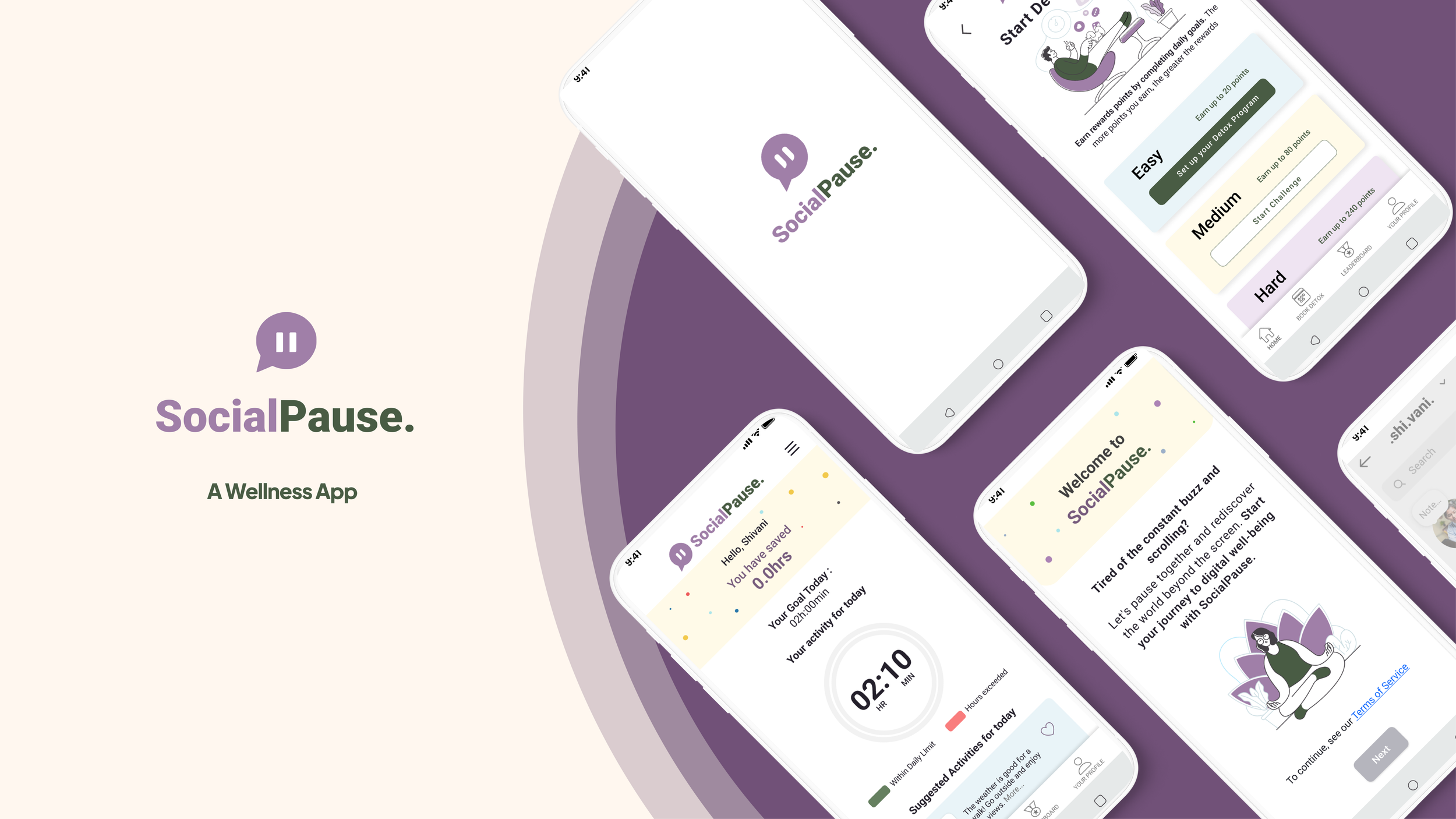
Our MVP
Our proposed solution is SocialPause, a wellness app designed to help users control and keep track of their time on social media platforms and utilize their time to do other meaningful activities of their interest. We decide to design a native android app as most of our user’s base uses android devices as shown in the survey results. The main features of the app are:
· Pop-up reminders showing the clock when they are about to exceed their daily time limit on social media and also when they has exceeded it along with suggestions to do other activities of their interests.
· Give goal-oriented rewards that they can utilise for doing other activities.
· Leadership board to compare and keep track of their progress with respect to other users on the app to keep them motivated
· Check and share their progress report with friends and family on a weekly, monthly and yearly basis.
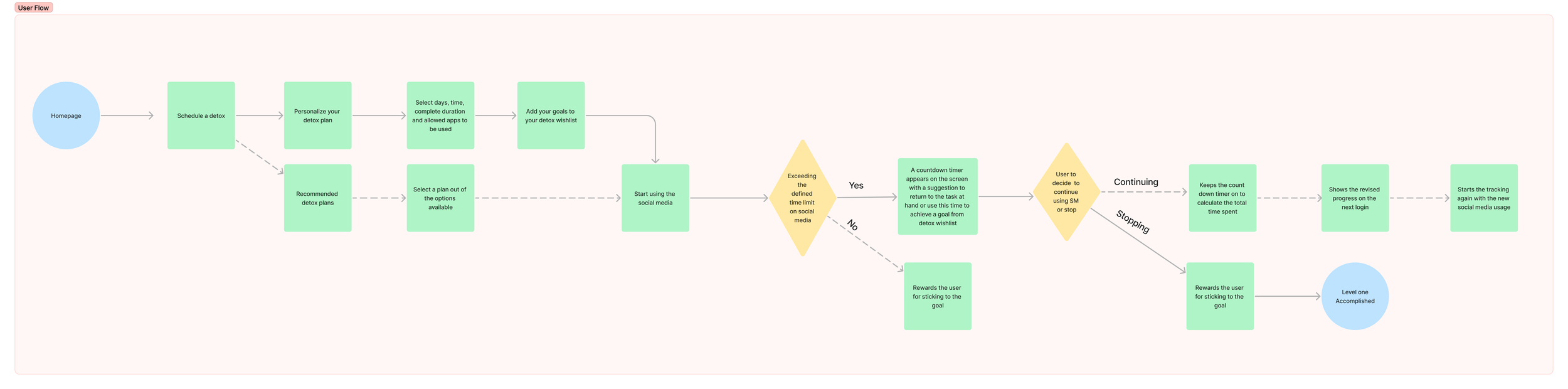
User Flow
Next step we created the path that the users take while using our app. The main scenario we decided to focus here for our prototype is when the user exceeds their daily time limit of using social media.
Lo-fi wireframes
After we have the user flow in place, we started with the initial sketches of the app to see how the flow would look like in the app. Me and my team created our own versions of the sketches and then collaborated together to come up with the final version of the lo-fi wireframes.

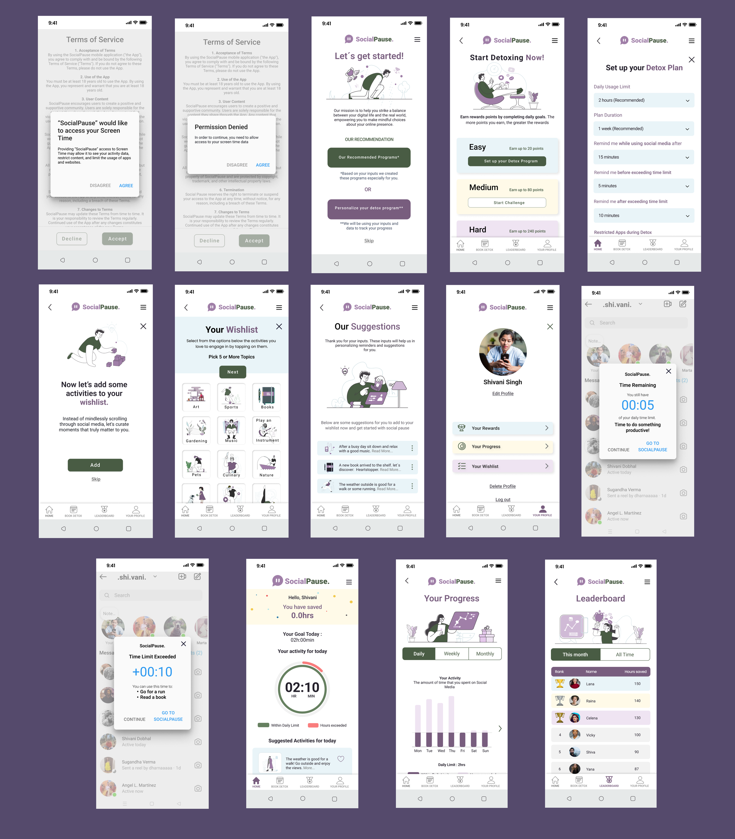
Mid-Fi wireframes
Next, we created the mid-fi version of our wireframes and did usability testing with some users to test its functionality. We conducted four usability test and asked the users to perform the following tasks in order:
Set a recommendation plan and edit it.
Browse your social media.
Go back to SocialPause and check today’s activity.
Check out the leaderboard.
Check out your profile page.
Check out your progress page.
Below are the initial mid-fi screens of the app with the results of the usability tests.

Most of the users liked the profile page and the leaderboard page while some users expressed difficulty in performing some of the tasks and understanding some of the terminologies used in the app such as:
Some of the texts are too small to read it properly
Should provide clearer terms and conditions about the app and about the usage of personal data.
Some of the screens do not follow Android elements.
Some texts that provide instructions and context are not very understandable.
After iterating the feedback that we received from the usability tests we created the final mid-fi version.
Identity Design
Now moving forward, the next step we took is to define the brand identity of the app and create the style tile which includes a logo, colour palette, typography, etc.
Visual Competitors Analysis
There are many apps on the market which deal with social media addiction. We looked at four competitors and analysed the visual elements of their apps.
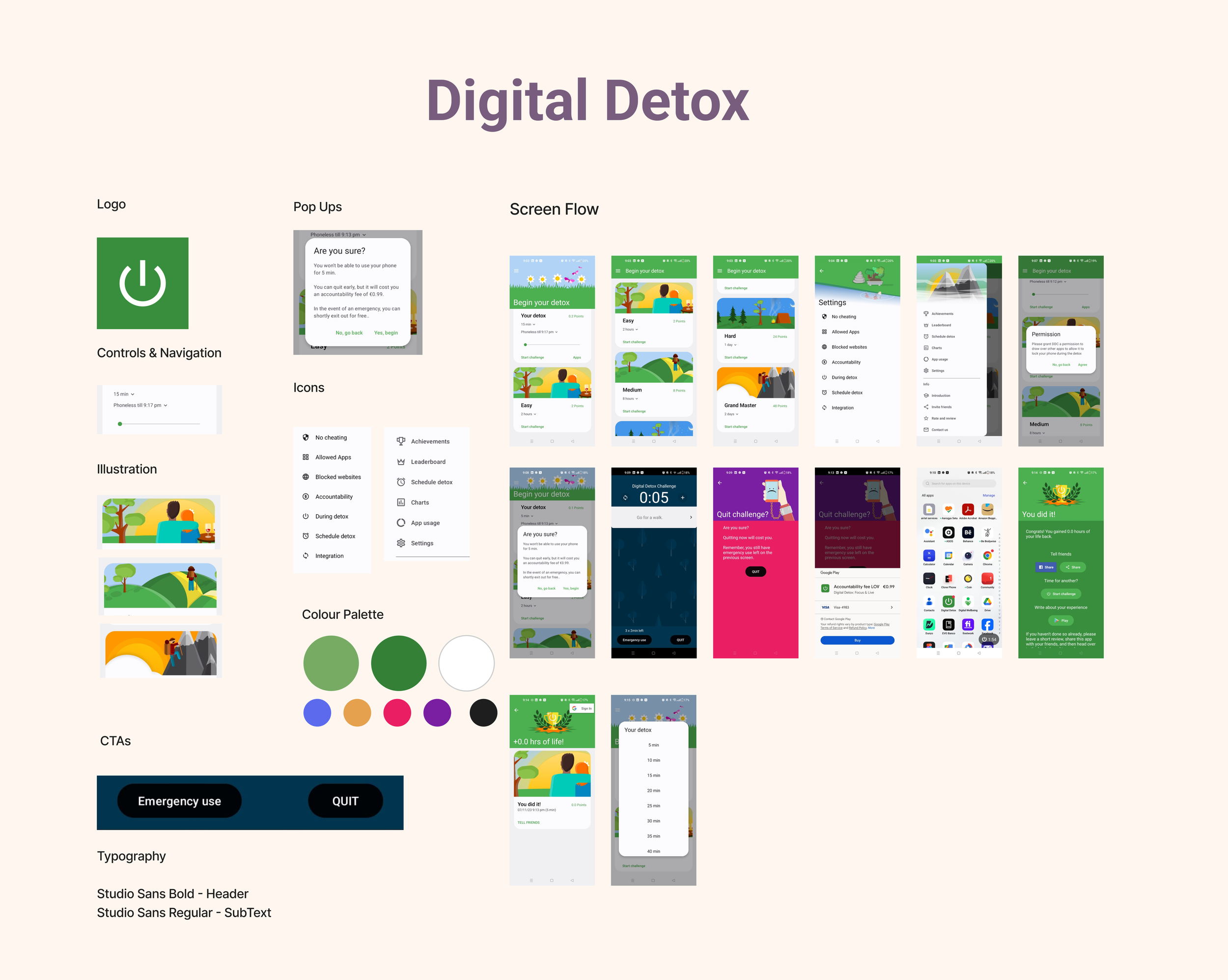
Digital Detox mainly blocks social media websites and apps and charges a fee for quitting. They have colourful illustrations on almost every page with green colour being predominant.
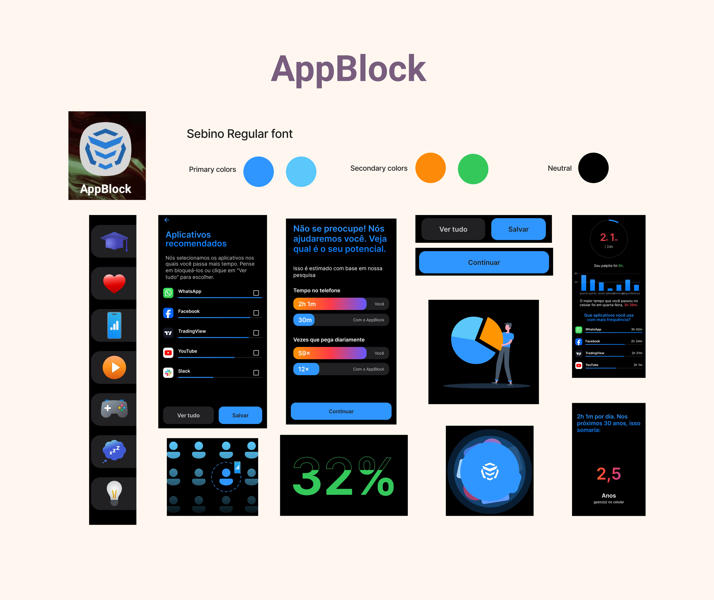
Appblock as the name suggests also blocks social media apps while stating how much time users will save if they use the app. They use a considerable amount of graphical images and have a dark blue and black theme on their app.
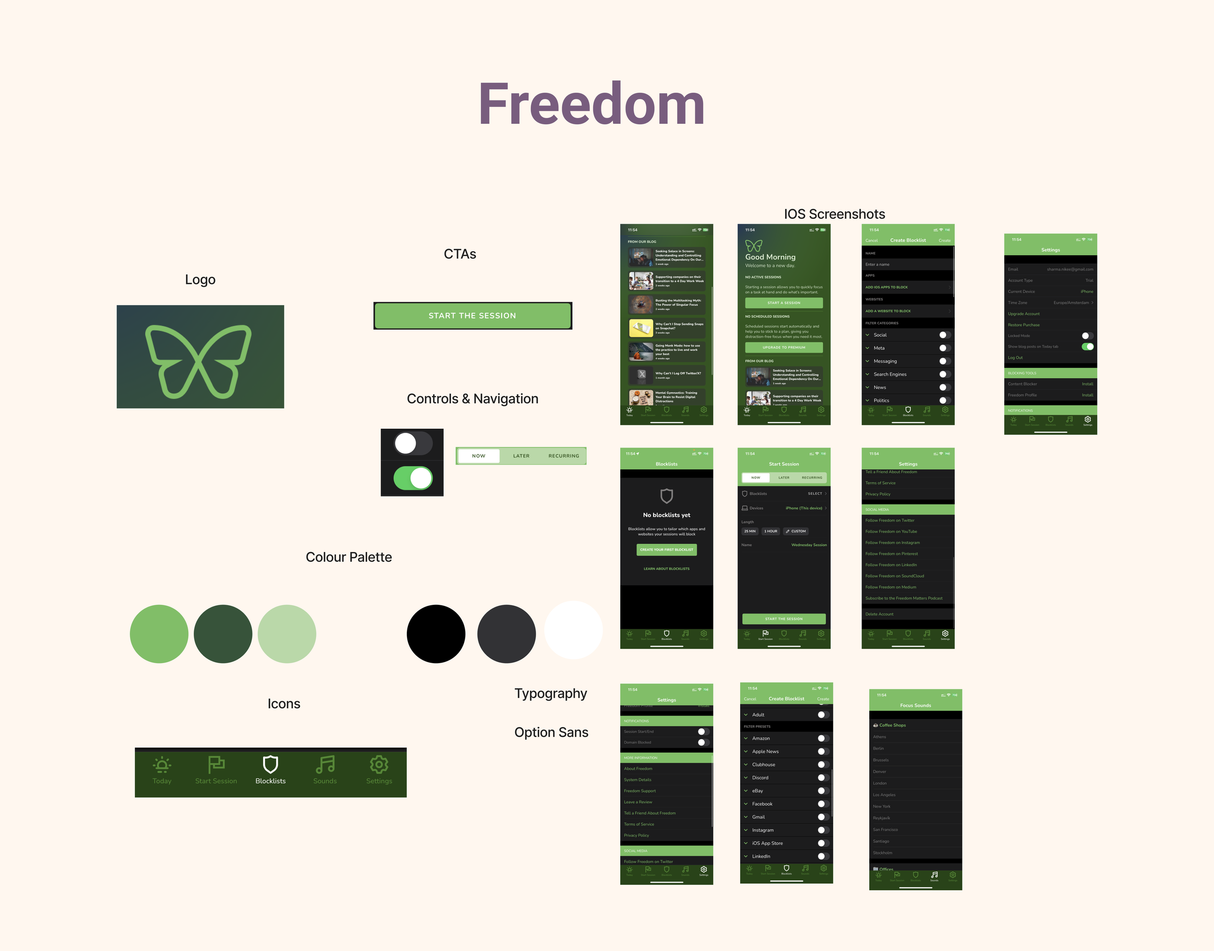
Freedom is another app which also blocks social media apps but here the users can select which apps to block. They have a heavy design with a lot of text and use the green colour for the whole app which includes the background colour, the icons and the CTAs.
Screen Time Challenge is an indirect competitor which deals with the overall screen time of the phone. They have a very light-themed app with soft colours and some illustrations. The texts of the app are a bit unreadable due to the colour palate. The users can set timers for blocking different apps on the phone.

Brand Attributes and Moodboard
After analyzing our competitors, we define some brand attributes which represent the essence and identity of our brand..

Final Design
We took colours from the moodboard and created two design versions and presented in a design critique session for gathering feedbacks. Below are the two versions with some corresponding comments on each version

After the design critique session, it helped us gain more perspective on our design ideas to come up with the final design.

Key Learnings
The entire journey of the project was really exciting for me as it covered the whole process of research to define the brand identity and the final prototype for an app from scratch. During the design process, it helped me learn many new things and refine my knowledge of previously gained concepts. Some key learnings are:
The surveys provide a considerable amount of information in a short period of time.
Usability testing is very important to do at an early stage of the design process because it allows us to refine the app.
Presenting our design in front of an external stakeholder provided unbiased feedback about our work.
Accessibility testing allowed us to measure effectively the colours and other elements. This is crucial to make our app suitable for people with disabilities.
Next Steps
The next steps to take after this are:
Usability Testing: Conduct usability testing with real users to gather feedback on the hi-fi prototype to identify any usability issues, pain points, or areas for improvement.
Iterate and Refine: Based on the feedback received, iterate the design to refine the user interface
Desirability Testing: Test with some real users to understand what they think about the aesthetics and visual appeal of the product.
Accessibility Consideration: Review the Hi-fi prototype for accessibility and ensure if the design meets accessibility standards for a diverse audience.