Introduction
As part of Ironhack UI/UX Bootcamp, this is the final project we had to work on before completing the course. I and my teammate had the opportunity to work for a Brazilian luxury furniture brand to improve their website.
Timeline:
4 Weeks
Team:
Client:
Nikeetaa Sharma. Jaume G. Gómez
Rua Madeira
My Role:
UX/UI Designer
Tools:
Figma
About the company
Rua Madeira is a luxury furniture company founded by Bastien Colombier and Hubert Trollé three years ago. It is a small company that sells designer furniture handcrafted in Brazil. Currently, they are focused on selling the pieces to other businesses or clients such as interior designers, hotels, etc all over the world.
The Problem
Rua Madeira's website is currently operating for their B2B sales and wants to enhance it to attract B2C customers as well. Currently, due to limited options for examining furniture pieces online, users lack confidence in purchasing furniture online.
The Solution
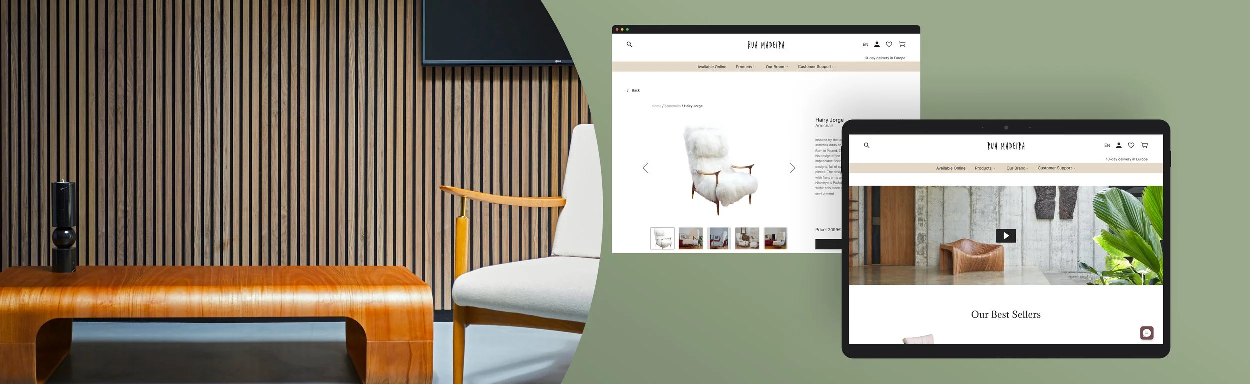
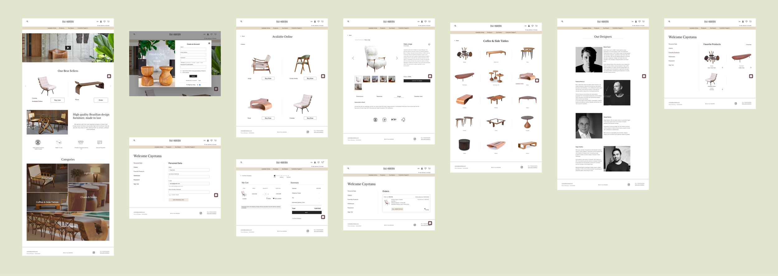
Design the new e-commerce platform for Rua Madeira with the existing B2B platform and give it a new and fresh look. We included several features like a zoomed-in view of every product to see the materials and finishing of the pieces, a personalized user area, a multi-chat feature to cater to several needs of the users, a page for the skilled designers of the furniture pieces, and a customer support section.
Design Process
Stakeholder Interview
To gather more information about the project, we had a kick-off meeting with one of the stakeholders. The meeting revealed their business goals and the scope of the project. Some insights are:
Introduce the B2C platform that will allow them to sell four pieces of furniture to customers directly from the website.
They have a website for their B2B customers and were unsure whether to combine their B2C and B2B businesses into one site or keep them separate.
Design the website with a new style tile that aligns with their brand image.
Secondary Research
The first task was to understand whether it's good to have a unified website that supports both B2B and B2C businesses or to have separate websites for both businesses. We went through various articles from websites like leanmarketing.com and business.adobe.com that suggest that having two separate can be difficult to handle as it will be double the cost and the work to maintain two sites. It can also create confusion among the customers and may land on the wrong website which can frustrate them. Also, the type of products that our client is selling are the same for both B2B and B2C. We finally decided that working on a single website that would allow them to sell their products to both B2B and B2C customers would be a wise decision.
Furthermore, we researched the furniture market and found that the furniture Market size is estimated at USD 688.74 billion in 2024, and is expected to reach USD 903.14 billion by 2029, growing at a CAGR of 5.57%. In addition to this, we also looked up to understand the users' behaviors when it comes to buying furniture online so that we can establish some assumptions before talking to the users.
Market Research
To understand the luxury furniture market, we conducted a feature comparison analysis between some of the competitors like Roche Bobois, Ligne Roset, and Sollos (now Jaderalmeida) to see what the different features these websites are offering that set them apart. We identified some common features that we thought would align with our brand’s business goals and took them as inspiration for our design.

User Research
Our initial goal was to interview some users who are the actual customers of Rua Madeira. However, we were informed by our stakeholders that their customers who are mostly affluent people like lawyers, entrepreneurs, doctors, etc., lead busy lives so it was almost impossible to reach them for a personalized interview.
Alternatively, we prepared a survey that can provide us with both qualitative and quantitative insights which our stakeholders could send to their customers to answer them quickly without taking much of their time.
Unfortunately, this option also didn’t work out for us as our stakeholders themselves got busy during that time and we couldn’t reach them.
Finally, we decided to create a survey (both English and Spanish versions) and publish it through different channels to target users who were interested in luxury furniture or those who had purchased luxury furniture in the past. Most of the users who answered the survey were females belonging to the age group of 30 to 50 years. You can see the survey results below:

We got some interesting and helpful insights from the survey which we synthesized through an affinity map such as:
Unable to check the furniture pieces in detail.
“By buying online I can’t check if they are comfortable or not nor the quality of the fabric.”
“I love to browse but I am skeptical to buy — as if I spend thousands of euros on furniture, I need to see it and feel it.”
Would expect to have high-end quality materials and craftsmanship.
“I would like to feel that they used some exceptional materials and expert craftsmanship.”
Want to have timeless furniture that they can pass on to future generations
“I would like this furniture to be something timeless, that I would keep my whole life and maybe even transmit to my kids!”
Hectic and unclear return policies
“Returning furniture will be a hassle since it is not a small item”
They want to have a personalized experience by communicating with the store owner or designer before buying.
“If I buy some expensive, unique piece of furniture I want it to feel special, so communicating with the store owner or even designer would be nice.”
User persona
With the survey results, we identified the behaviors and pain points of users which helped us build our persona. Meet Cayetana Ramírez. She is a sophisticated furniture lover who is a 40-year-old lawyer living in Spain and represents the behaviors and pain points of our target users. We made all our design decisions based on her.

Problem Statement
Now to summarize the pain points of Cayetana, we formulated our problem statement which goes like this:
Sophisticated furniture lovers need to purchase uniquely crafted, quality furniture online that meets their expectations by checking it in detail because they don’t have the opportunity to access the furniture pieces, not feeling confident before committing to a purchase.
Ideation
With the problem statement in mind, we saw some opportunities for ideating the solutions for Cayetana’s pain points:
· How might we help Cayetana feel the furniture aligns with her expectations?
· How might we help Cayetana check the furniture pieces in detail?
· How might we help Cayetana feel more confident before making the online purchase?
We used the method of crazy 8 and quickly came up with several ideas. Then we voted the best ideas and arranged them in order of priority using the MoSCoW tool. Due to the time constraint for this project, we decided to focus on the “Must Have” part.

The ideas that we decided to focus on were:
Introducing videos featuring previous customers trying out the furniture pieces to share their experiences.
Make an individual section for customer services which involves chatting with an assistant, FAQs, return policies, etc.
Provide users with a personalized feeling by having a personal area on the website.
Give a zoomed-in view of every piece of furniture to see them in detail.
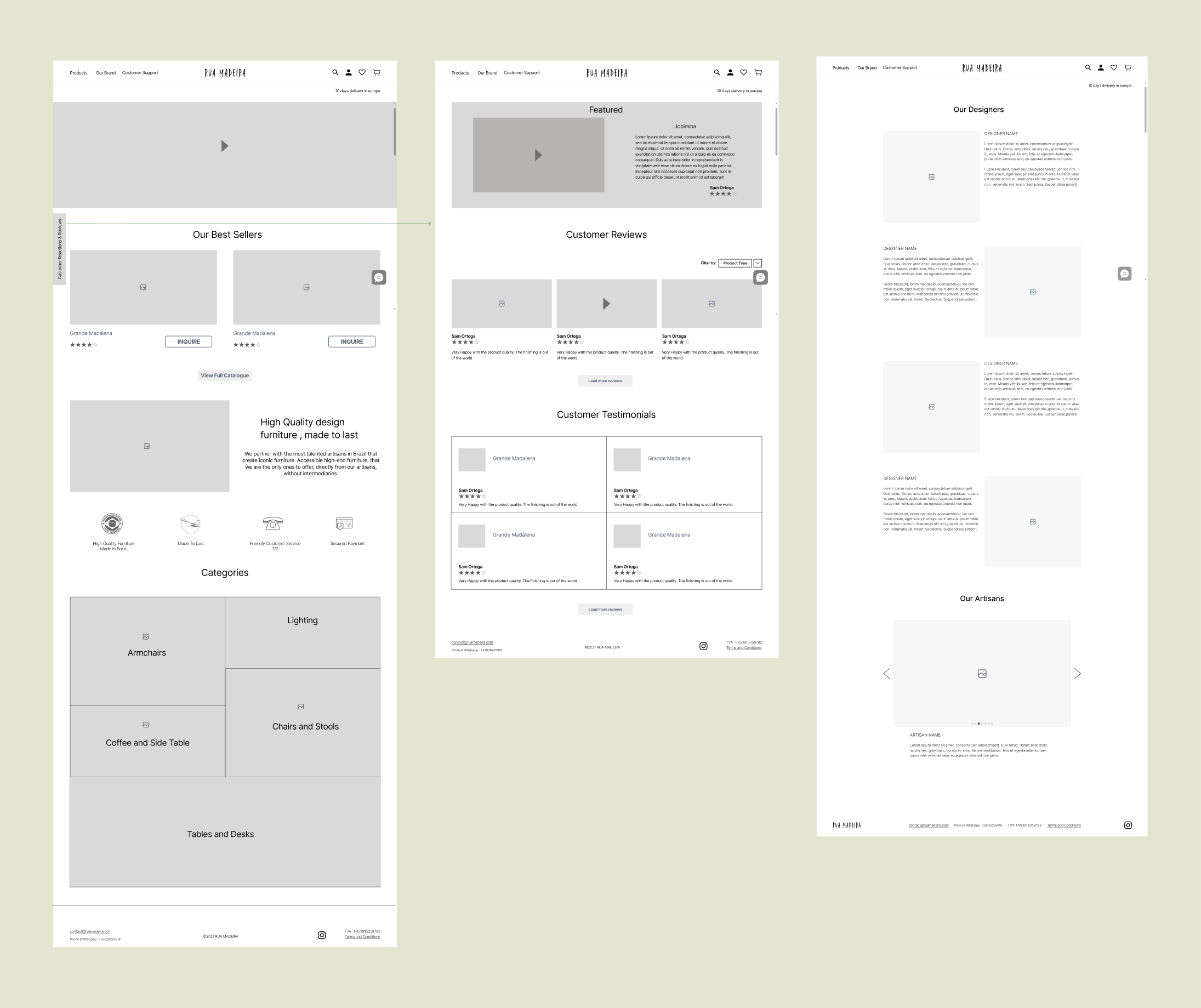
We then quickly created some initial sketches of the ideas using pen and paper to see how to place those ideas in our design. From there we digitized them and created the mid-fi wireframe to show our ideas to the stakeholders and test its functionality with some users.

During our discussion with our stakeholders, they said that getting their customers to make a reaction video on the bought pieces will be an impossible thing to do as the reason remains the same: They are busy people!
So that idea was discarded.
Next, we thought of trying out the idea from the “Should Have” list:
· Include videos of the process of creating the furniture pieces by the artisans and give information about the designers.
For this idea, the stakeholder told us that currently they do not have any videos regarding this and they are not sure if they will have them in the future. So instead, we decided to focus on giving information about the designers.
Usability Testing
We digitized our ideas and created the first draft of the mid-fi wireframes. We tested it with four users and gave them certain tasks to do to check if they were able to navigate easily and complete the tasks efficiently.

The usability tests revealed some problems in our designs that needed adjustment and some terminologies were not understandable as well. So, we took all the comments and feedback and iterated them to create our final version of the mid-fi wireframes.


Site Map
With testing and numerous iterations, we organized all the contents and defined the structure of the website. The below diagrams show the site map of their current website and the improved site map for our design.

Current Site Map
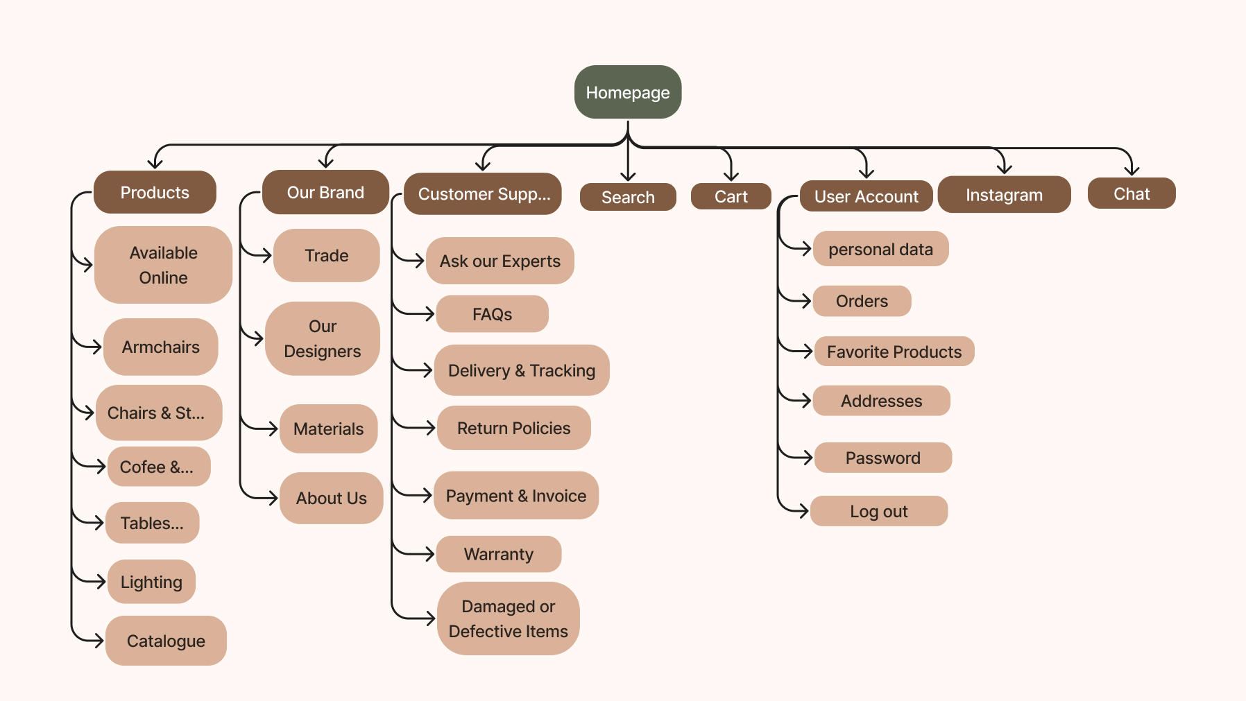
improved Site Map
Visual design
After learning more about the brand from the owners of Rua Madeira, we could define some brand attributes and create a moodboard that captures the essence of the brand. This helped us pick the color palette and typography that we used for our design.

But before finalizing the visual elements for our design, we decided to take a look at some of the competitors and see what trends they follow, how they organize their content visually, how they display their products on their websites, etc
We found some insights with this analysis:
The use of black and white colors is common on all the competitors’ websites
They use large images and videos for their products
The overall design is very minimalistic with plenty of white spaces.


Taking cues from competitors, their use of black and white colors on their website adds a touch of luxury. So, we decided to use black as the main color and white as a background color to keep it minimalistic. But what sets our brand apart is that it is Brazilian. To give the Brazilian vibes we decided to go with the colors of beach sand as a secondary colour which gives a cozy feeling for the users on the website. Also, we went for the Brazilian forest colors, green and shades of brown. We didn’t want to overwhelm the design with too many colors, so we used them as accent colors.
For the typography, we went for a serif font Adamina for the headings, and for body texts we used Inter.

Feature Added
1. Multipurpose Chat: The actual website of Rua Madeira already has a chat option but it is a simple one where the user can leave a message. In the chat we added, it has multiple options to select from like
Talk to a furniture expert if they have any queries regarding a product or need guidance choosing a product to buy.
Track order option to quickly track any order they might have placed previously or currently purchased.
FAQs
Call me back
Customer Assistance
Another option for users to talk about anything else they may require if their purpose is not included in the above option.
The purpose of giving options is to guide them and not be worried about performing these tasks.

2. Detailed View of a Product: Every product page has a section where there is an image of the product with multiple hot spots to click. When a user hovers over the hot spots, they can see a zoomed-in view of those areas of the product. This feature will ensure the users see the materials and texture of the furniture closely.

3. Designers’ Page: Every piece of furniture in the brand is created by some well-known designers in the industry. To make the users feel more connected to the pieces, we included a section on the website giving details of every designer with their photos and descriptions. This will help users understand that the pieces are luxurious and long-lasting and also discover the unique craftsmanship and creativity behind the furniture.

4. Favorite Products: When a user creates an account on the website, a personal area will be created where they can view their liked pieces of the website whenever they want. This will help users review them anytime they want and make a purchase quickly.

5. Order Details: In the personal area, we put a section to provide the order details. This way users can view any orders previously or currently purchased anytime they want. They can also track their order and modify them before it is shipped. This page for past orders will also help them to reorder a piece of furniture.

6. Customer Support section: We included this section in the main navigation bar of the website, as users indicated that want to know about the policies of the brand as well. This was already there on the actual website but was placed in the footer with small fonts which made it hard to find. We included several pages in this section, each page addressing different customer support policies like Delivery and Tracking, FAQs, Return policies, etc. We added an Ask Our Experts page where the customers can fill out a form to query about any product or if they have any issues with a product.

Conclusion and next steps
This project was an incredible chance for me to put my skills to the test in a real-world setting. I got to engage with stakeholders, grasp the business objectives, and ensure that our solutions addressed both the business’s requirements and the users’ needs. But at the same time, we encountered various challenges during the project as a team, the most significant was our stakeholders were unreachable when needed. However, we swiftly found solutions, showcasing our problem-solving abilities. This experience taught us the importance of being prepared for challenges in the design process and how overcoming them efficiently is essential for success.
If we had more time on this project, we could have tested our prototype with some users from Rua Madeira and seen if the solutions were solving their problems.
The next steps that we would take if we continue working on it will be:
Test the functionality of the Hi-fi prototype with some customers of the brand
Iterate the design based on the feedback and do more research if required.
Check the prototype for accessibility.
Design the remaining screens to complete the whole website design.
Check with the stakeholders for a go-ahead and prepare for handoff.
