Introduction
This is a case study for designing an e-commerce website for the Ironhack Bootcamp.
For centuries, it is seen that jewellery has been an important part of both men's and women’s lives and it can have many significances as well. A piece of jewellery brings immense joy to a person as it is known to be a symbol of love, a fashion statement, a timeless gift and much more. It not only enhances the outfit but can also boost self-confidence in a person. It has also been the earliest form of artistic expression.
Nowadays due to industrialization and fast fashion trends, jewellery is very easily accessible to the public and while it is a good thing, it is losing the artistic touch slowly due to mass manufacturing. On the other hand, a piece of handmade jewellery can be very precious as it depicts creativity and craftsmanship, and the story and emotion behind each piece of jewellery add up to its uniqueness.
The handmade jewellery business is generally a small-scale business. Small-scale businesses are customer-oriented. They provide a personalised touch to their products and want their customers to feel satisfied each and every time they buy a product from them. E-commerce can be very helpful for small-scale businesses like this, not only to earn more profit but also to expand their customer base and retain the support of their customers. In this project, we got the opportunity to design an e-commerce website for a handmade jewellery brand called “Asteria Accessories”.
Nikeetaa Sharma. Paola Karolina Villarraga Pérez, Christopher Hittinger,Dina Shkamo
Timeline:
5 Weeks
Team:
Client:
Asteria Accessories
My Role:
UX/UI Designer
Tools:
Figma
About the Brand
Asteria Accessories is a handmade jewelry brand based in Majorca, Spain which is owned by an amazing and talented handmade jewelry creator Marta Roig. This brand is very close to her heart. It gave her motivation to keep going during some hard period of her life. The name of the brand “Asteria” means Goddess of the stars and is inspired by nature and the stars. The brand gained great popularity during COVID-19 times via TikTok and has been growing since then.
The Challenge
Currently, Asteria Accessories only has an Instagram and TikTok page. Our main task was to build a website for the brand.
The stakeholder has a close relationship with her customers, and it’s very important to her to not lose that in the process. When we talked with the stakeholder, she said that she has some specific goals that she wants to meet with this website. To quote her:
“I want my brand to grow”
“I want the customers to feel like the purchase was easy”
“I don’t have a lot of male customers but I would like to have more”
“Proximity with my customers is super important. And I don’t want to lose that”
“I would like to deliver outside of Spain, but now I don’t”
Another challenge was to make the website stand out as there are many competitors on the market that sell handmade jewellery.
Market Research
Now, it was time to see what is there in the market, who are the biggest competitors and what features are already working for the users.
So, we conducted features comparison analysis among four different direct competitors which are Coeur de Lion, Claude Paris, WolfandMoon, Hand&Soul and our brand. Below is the chart of our feature comparison:

We observed some gaps in the market trends eg. the wishlist feature. It is seen Couer de lion and hand&soul both have this feature but Claude Paris and wolfandmoon doesn’t provide it and our brand doesn’t have a website yet so naturally doesn’t have this feature. But this can be seen as a design opportunity that we can consider for our website design.
Then we conducted SWOT Analysis, to understand the internal strengths and weaknesses, and the external opportunities and threats of our brand. Below you can see the detailed analysis.

The next step was to know about the user trends and behaviours of buying jewellery. In the poll conducted by The Plum Club, out of 2,000 people between the age group of 25 to 60 years, who purchased jewellery in 2022, 62% said they bought at least one piece of jewellery via the web. Among those, 31% bought directly from the jewellery brand’s website, 30% bought from online marketplaces like Amazon, 27% from local jewellery websites, 7% from luxury e-brands and the remaining 6% from social media pages. Another 10% of the 2000 bought in-store but said online browsing led them to that location.
It is seen that the percentage of online jewellery shopping is very high and they gave many reasons for buying jewellery online. Some of the reasons are:
Greater convenience of purchase
Variety of product options
Opportunity to compare prices
Lower Price ranges
Free shipping options
Easy return policies
User Interviews
Now we moved on to the most important part of UX research which is knowing the users. We conducted a total of six user interviews to learn about their needs, behaviours and frustrations. All our interviewees were women aged between 20–50 years and who buy jewellery online.
We found some useful insights from the interviews such as:
· Customers feel happy when they receive the product, especially when it matches what was shown on the website.
· They buy from websites that they are aware of and trust completely
· Detailed information and transparent communication on the website make them want to buy.
Some of the major pain points that the interviewees indicated are as shown below:

User Persona
From the interviews, we have learned that the main key points are Trust and Transparent communication in the website.
So, we were finally able to build our persona Paula Álvarez that best represents our target audience. She is a 21-year-old student who lives in Madrid, Spain, and has very specific goals and frustrations as she keeps saying:
“I would love to buy handmade jewellery online, but I am afraid of being decieved”

User Journey
We then created a user journey map of Paula where she goes through social media and finds a page of a jewellery brand. She liked the page and went to visit the website. While checking out a product on the website she finds that there is lack of information on it. She finds that distrusting and immediately leaves the website without buying anything. You can see in the image below, the various rollercoaster of emotions during each stage of her journey, and finally ends up being disappointed.

Problem Statement
By looking at Paula’s user journey, we found some design opportunities on how might we improve her user experience so that she doesn’t feel disappointed which are as follows:
How might we create more proximity with the creator and brand?
How might we provide Paula with the information she needs about the product?
How might we provide Paula with the information about post-sales service?
How might we build credibility on the website, so that she stays and buys the product?
So, this finally led us to our problem statement which is:
Online shopping fashionistas need to find a jewellery selling website with credibility because they need to trust the brand before they make the purchase.
Features Added
With the problem statement in consideration, the best solution is to create a website that is transparent in terms of trust and credibility. We added some important features to ensure this:
1. User Reviews section on the homepage — The homepage consists of real users feedback who have already bought a product from the website. This will ensure credibility and will let users know about the product and the services provided.

2. Bio and About Us Section — This section will let the users know about the owner, missions, and goals of the brand which ensures the website is reliable. It also consists of a video tutorial of products by the owner.

3. Filters for price range and colors — This feature is added to let users have control to choose the product of their choice by colour and price range.

4. Detailed product description, videos, FAQs, and reviews — This section is added to the individual product page which provides detailed information about a particular product with videos and reviews. The FAQs section lets users ask questions and get answers from the owner or real users if they want more information about the product.

Wireframes
With the solution and the information architecture in place, we then created the mid-fi wireframes of the website. We created the Homepage, Product Categories page, Product list page, individual Product page, Login Page, Sign-Up Page, Shopping Cart, Delivery Details, Payment Details, and Purchase Confirmation which indicates the ‘Happy Path’ of the user flow.
After this, we did usability testing of the mid-fi wireframes with three users to check if the functionality was working for them. We gave them some tasks to complete on the website and observed their actions. We noticed they were having trouble with some functions such as:
They were expecting a search bar to search for a product on the homepage which was not present
They wanted to filter the jewelry by colors of their choice
They wanted to know the expected delivery time for a product they want to buy
They would like a gift note option if they want to buy for someone else as a present
They would want to change the discount coupon at any stage of the order purchase process.
We did the final iterations of our mid-fi Wireframes using the usability testing results and moved on to the process of creating the Hi-Fi prototype.
Below are our final mid-fi wireframes:

Identity Design
We created the moodboard that best represents the visual attributes of our brand. The brand attributes that we went for are:
Warm
Homemade
Fresh
Stylish
Approachable

Below is the color palette and the typography that we went for our website:

Hifi-Prototype
We created our first draft of the Hi-fi wireframes with different color palates and typography options and presented them in a design critique session with our fellow designer students for their opinions. We got some valuable feedback and iterated those in our final design. Some feedback included:
Create a better hierarchy of the color on buttons
Make spaces between elements to make the pages more consistent
Organizing the footer in a clearer way
Resizing the elements of the shopping pages to make them more legible
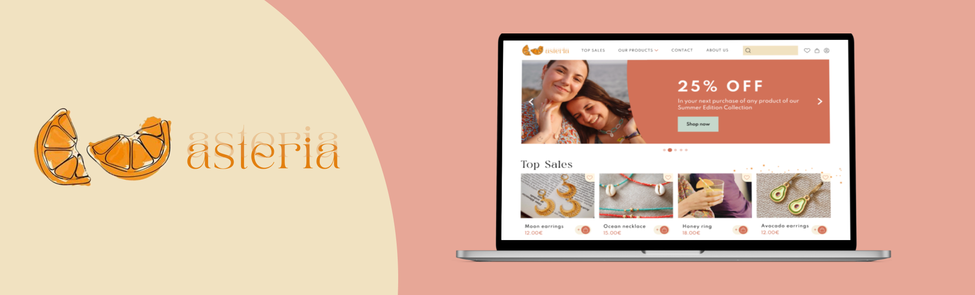
Below are the pages of our final Hi-fi prototype:


Learnings
As this is my first project of designing a website, I have learned some new skills that will also come in handy for my future projects such as:
How to conduct a stakeholder interview
How to overcome the challenges of communication in a team
The process of designing a Hi-Fi prototype
Being open-minded to constructive criticism
Next steps
As we didn’t cover the testing phase in this project for our final design, the next steps would be:
Testing the current Hi-fi prototype with our stakeholders and some users
Iterating the design based on the results of testing.
Beginning to research and design new areas of the website (e.g., loading page/icon, 404 error, blog, etc.)

