Introduction
As part of the Ironhack Design Bootcamp, I redesigned an existing app interface by analyzing the design heuristics to improve its user experience. The focus of this project was UI design. Pathé Cinemas, whose app I use frequently to book movies and shows is a major cinema company in Europe. As a user, I struggled to navigate within the app and felt the scope of improvement on the overall look and feel. So, I chose to work on the Pathé app for this project.
Nikeetaa Sharma
Timeline:
2 Weeks
Team:
Client:
Pathé
My Role:
UI Designer
Tools:
Figma
Heuristics Analysis
The first step was to analyze the app to identify the well-designed areas and also the areas that can be improved. To understand the pain points of users there was no UX research involved, instead, I applied Nielsen’s 10 usability heuristics for user interface design. Design heuristics are rules of thumb or principles for design, created by Jacob Nielsen widely followed as best practices to design user-friendly interfaces.
I found out a lot of areas in the app that do not follow the design heuristics. Some of the findings are:
1. Consistency and Standards:

On the homepage of the Pathé app, you can see the size of the icons is not the same throughout the whole tab bar at the bottom. Secondly, the clock icon in the middle is bigger than the rest which gives a feeling that it is selected. Another observation, the clock icon can mean previously purchased or show timings which can create confusion for a first-time user not knowing what page to expect until this icon is clicked. To remediate these points, all icons of the bottom tab bar could be made of the same size with a description under the icon.
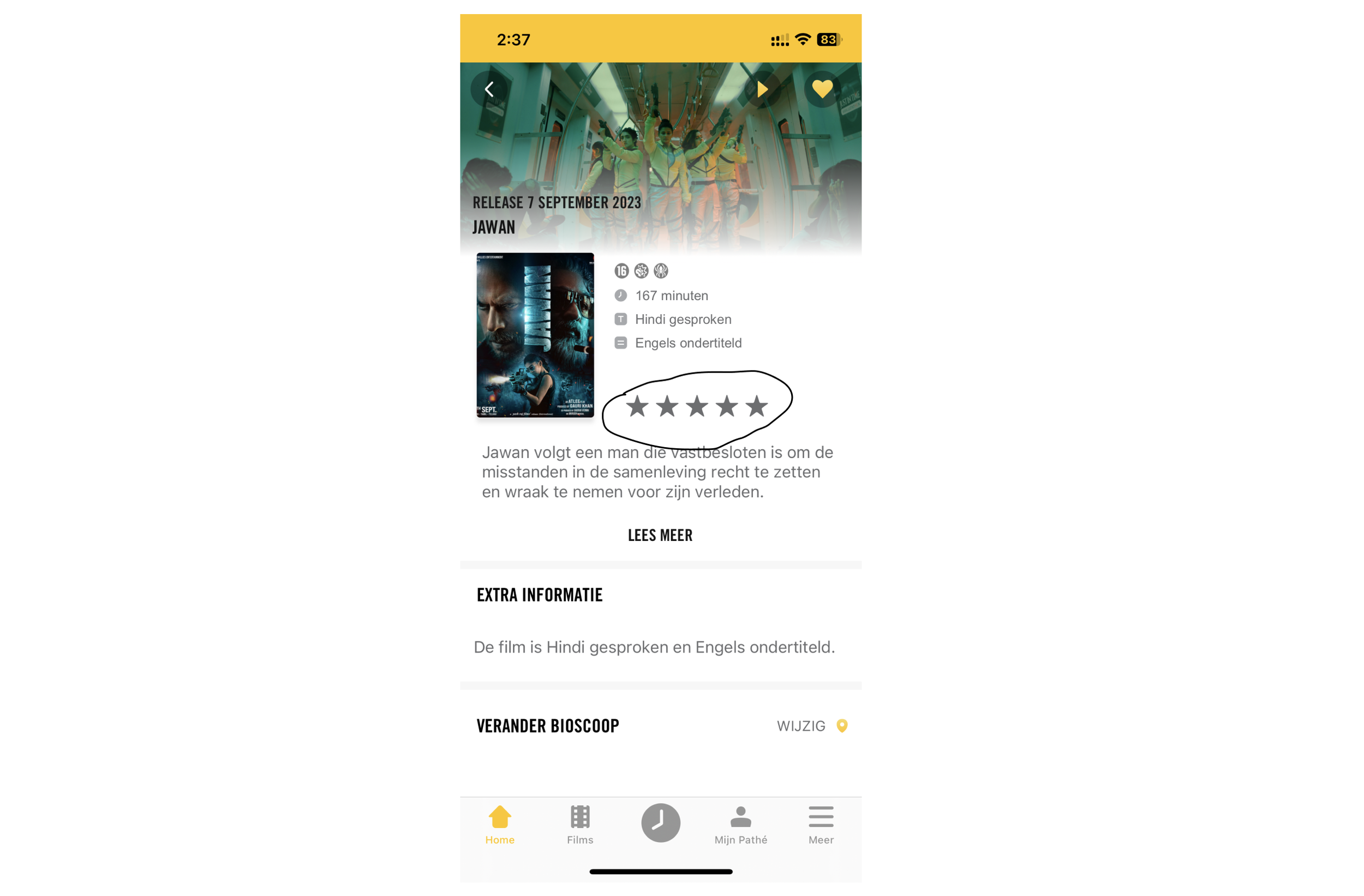
The movie description page has star icons to show the ratings received in that particular movie. The appearance of this makes it difficult for the user to exactly know the user rating of the movie. Also, it is not clear whether the stars are filled or empty. This can be improved by using color variation in the stars with a rating label in the text alongside it.
2. User Control and Freedom:

After proceeding with some navigations on the app it is hard to understand how to come back to the homepage. Naturally, a user would click the home icon to come back to the homepage but here it behaves differently. Each tab icon has its own sub-navigations, so it opens the last page that the user interacted with previously when they clicked on the homepage icon. Also, I observed that by taping the home icon again it behaves as a back button within the home sub navigations. This seems a bit complicated and complex. To make it simple, the bottom tab bar can be removed from all the pages except the starting page of the tabs. The back button on top of those pages without the tab bar should be enough to help navigate the user to the starting page of each tab.
3. Visibility of system status:

When a user wants to open any page in the app, the app takes some time to load the page. In the meantime, the app shows a blank screen while loading. This can be frustrating for the user not knowing whether the page will open or not and how much time will it take to load the page. This can be tackled by informing the user that the page is loading and that it has to wait for some time while loading.
Visual Competitive Analysis
Now that I have analyzed the app, it was time to look at some competitors’ apps and see how they look, what color palette and typography they use, icon designs, CTA’s, and overall design. I conducted the analysis among two direct competitors: Bookmyshow, and Inox Cinemas, and one indirect competitor: Netflix.
Below you can see the detailed analysis of the three apps:

Below is my proposed style tile:

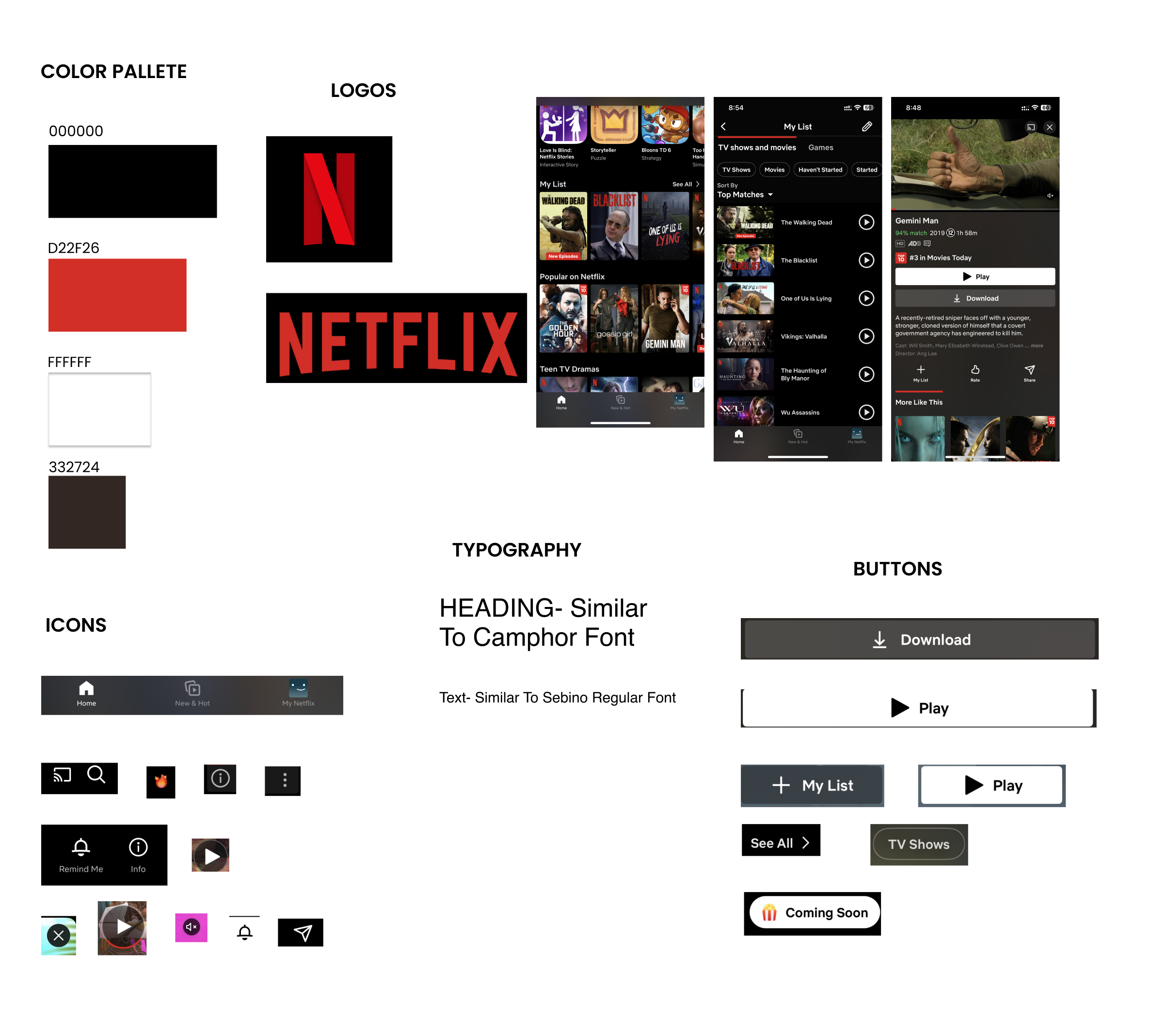
Some of the main insights that can be drawn are:
A white background is used on Bookmyshow and Inox cinemas with dark primary colors and Netflix follows a dark background.
All three apps follow the horizontal layout of the movie cards
Primary CTAs are square-shaped with smooth corners. Secondary CTAs have different shapes and textures.
Heading fonts are sleek and compressed but the text fonts are more readable.
Information Architecture
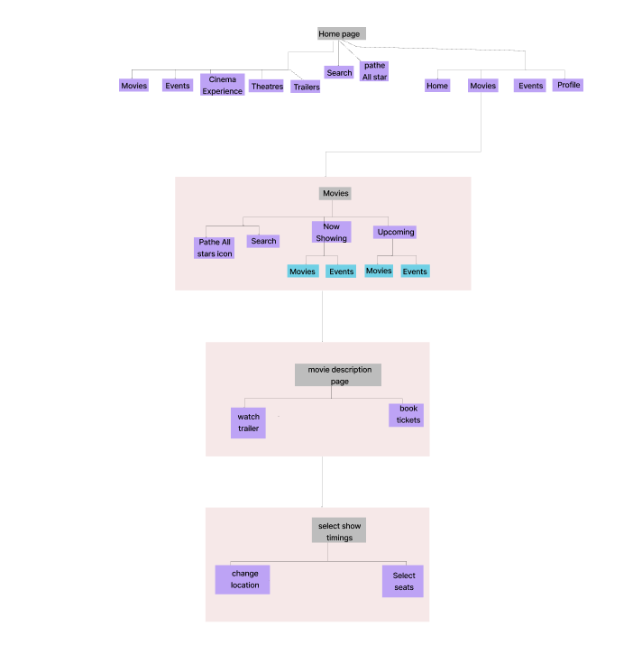
Now moving onto the functionality and navigation of the app, I analyzed the current site map to understand the flow and content, and what could be done to make the app simpler. I kept the scope of this analysis to three pages: the homepage, the movie list page, and the movie description page. Below is the current site map:

The current app is in Dutch language but I translated it to English for my redesign.
Homepage — Here, the bottom tab bar has five icons which are: Home, Films, Times and Tickets(clock icon), My Pathé, and More. The upper navigation bar has: New in Pathe, Shortly, Events, and Kids. I restructured and renamed it a bit to make it more coherent and organized.
Films — This page has four main sections: Topical(Now Showing), Specials & Events, and Kids and Expected(Upcoming). The topical includes all the current movies playing in the theatres and also special events. So having another option for Specials & Events can create confusion and does not need to be included in this page. Specials & Events and Kids option can be included as a filter on the Topical(Now Showing) and Expected(Upcoming) sections.
Films page — This page is the movie description page which consists of descriptions, trailers, and the option of selecting the location and date to book tickets for the movie. Having all these options on the same page makes the user scroll down a lot to see more information about the movie and also makes it hard to understand the flow of booking the tickets. I created two pages for these functions: one for movie descriptions with trailers and another one for selecting the date and location to book tickets for the movie.
Below is my proposed site map:
Proposed Design
After analyzing the app closely, I picked one flow i.e. booking a movie ticket to work on. My goals were to make this flow more understandable, optimize navigation on the app, and give it a new and fresh look.
Moodboard
Using the app for a while now, I could derive some brand attributes that best represent the app. Since it’s a movie ticket-buying app, it relates to entertainment and makes movies and events easily accessible to users. It keeps its users engaged with all the relevant and trending movies and events. The brand attributes are as follows:
Entertaining
Engaging
Relevant
Accessible

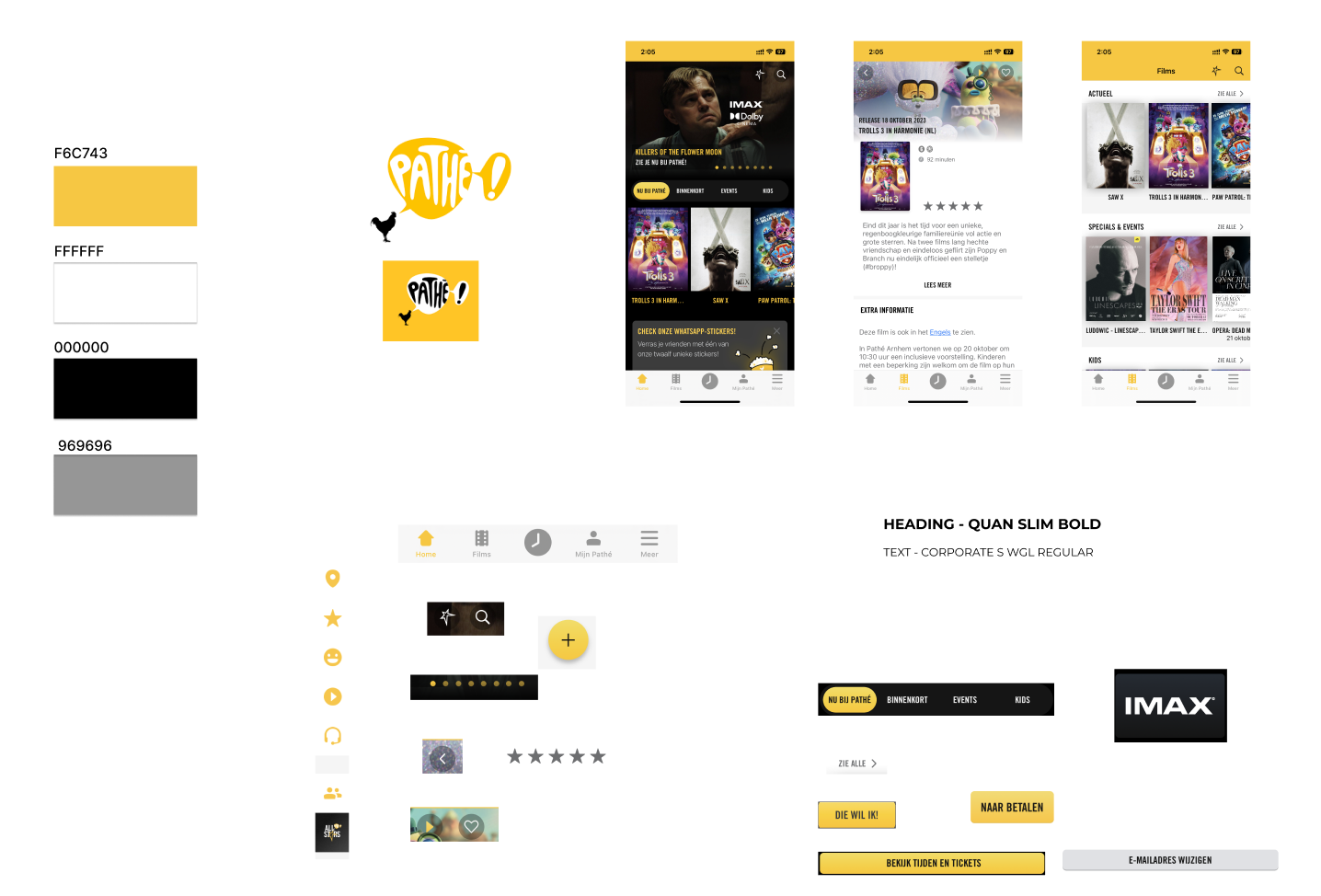
Colour Palette
The colour palette used in the existing app is yellow, white and black. Some users can find it difficult to view yellow on a white background. I decided to redesign it in a much trending and classy dark mode with deep blue and yellow. I kept the yellow colour in the app because it’s the identity of the brand. All the colours are derived from the moodboard.
Typography
· Logo design — For the logo, I used the font Baradig in bold. This font has a very digital structure to it which can be very enticing for creating movie titles and logos.
· Headings — For all the headings in the app, I used Bison Bold font which has a sleek and compressed look. As per the visual competitive analysis done earlier, similar fonts are used for headings in movie apps.
· Text and CTAs — I went for a more readable sans-serif font which is Helvetica for all the text and CTAs in the app. It creates a very nice visual balance between the typefaces of headings and texts.
Icons and CTAs
I changed some main icons in the app and created new ones giving it a more comprehensible look. The main call-to-action buttons are almost similar to the current app which has rounded corners with yellow fill.
Below are the current style tile:

Hi-fi Wireframes
I started with creating the starting page of the app with a little animation, then the homepage, movie lists, movie description page, and select show timings page. The current app does not have an error page when you search for the wrong movie. So, I created that page as well. The new color palette and typography are applied to all the pages in the app. Below are the pages of the Hi-fi prototype and also the comparison to the current app pages:
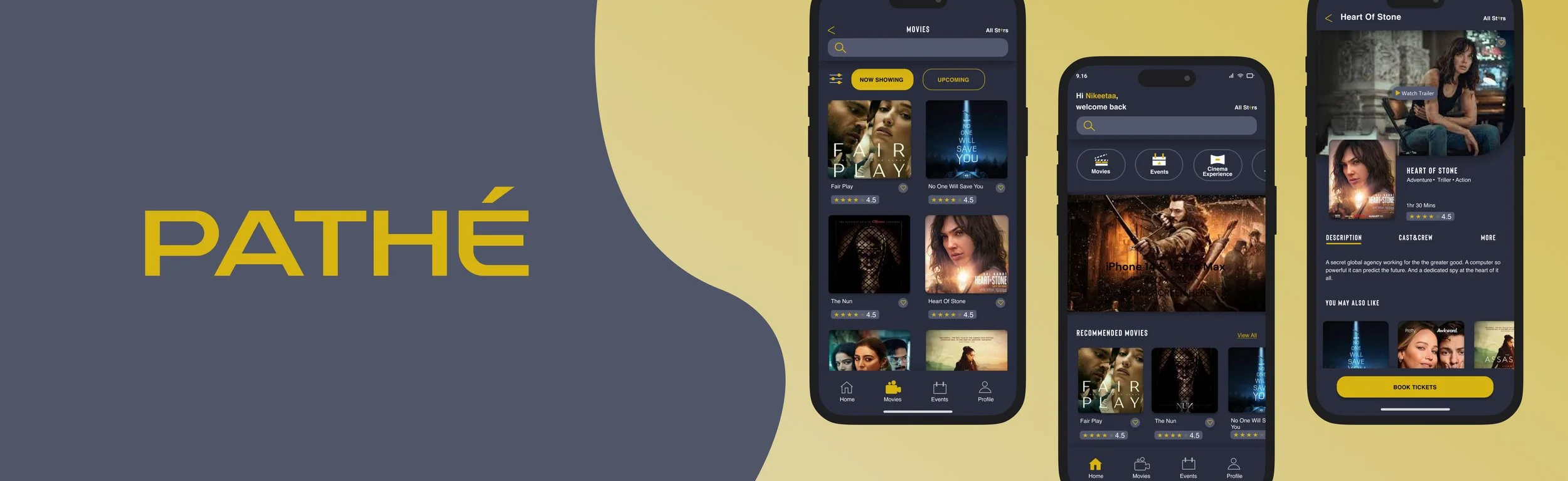
Homepage

As you can see in the images above, the background colour is changed from jet black to deep blue. Also, the placement of the top navigation bar is changed with icons and clearer text. Currently it has New in Pathé, Shortly, kids and special events. I restructured it to Movies, Events, Cinema Experience, Theatres and Trailers. The bottom tab bar in the current app has Home, Films, Times & Tickets, My Pathé and more. My redesign has Home, Movies, Events and Profile. I changed the icons here and added text to it. The idea here was to give more control and freedom to the user making it easier to move from one page to another.
Movies Page

On this page, I revised the layout a bit. The current app has a horizontal layout to this page and my redesign has a vertical layout. Also in the current app, to see all movie lists the user has to click see all which means it requires two-page navigation. I just kept two sections that seem more relevant: Now Showing and Upcoming which can be navigated through a horizontal swipe which saves the users from scrolling down a lot to see all the sections available on that page. The Kids and Events are placed inside the filter icon on the top left under genres.
Error Page
When the user searches for a movie that is not currently playing in the theatres or is not available, the current app does not give an error message to the user. I created this error page which tells the user about the unavailability of the movies and also gives some suggestions with relevant movies for the users to choose from. In the prototype, I used a movie named “Fat Guy” to search in the search bar. This move does not exist so the app returns an error in this case. You can try this in the prototype.

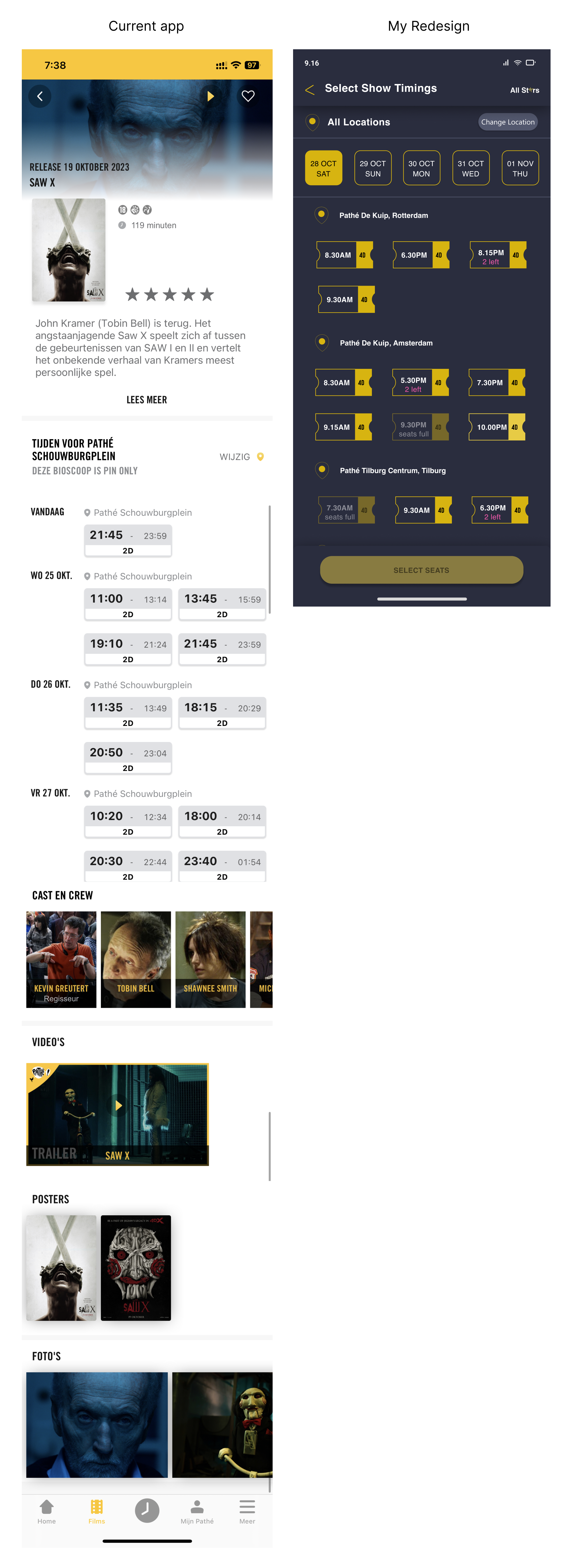
Movie description page
In the current app, the description and information about the movie are in a horizontal layout. I used swipe navigation on the page for viewing different movie information sections to ensure less scrolling. I placed a fixed button “Book Tickets” at the bottom of the page to guide the user with the flow. Below you can see the comparison:

Select Show Timings
The option to select the show timings is currently on the same movie description page. The button to select locations is very small and difficult to identify as it doesn’t look like a button. To ensure a smooth and simple flow, I have created a different page for this entire function.
Conclusion
After completing this project, which mainly focused on UI design I learned:
· Analyzing the functionality and visual aspects of an existing app.
· Working with the design heuristics to understand the areas of improvement.
· Figma knowledge to work with components and variables, simple animations, etc.
· Working solo on a design project under a short deadline.
The design critique at the end of the project was also helpful and essential in understanding different perspectives and pitfalls that be improved in the future. Testing this design with some users can reveal its usability further. A future note to me would be to try out other flows in this app and redesign it.

